You keep hearing about French country decor colors, and maybe you picture some pale blue kitchen with a rooster on the wall, or maybe you don’t, maybe you think it’s all beige and boredom. It’s not that simple. The color palette in French country interiors feels like it grew out of stone walls and wheat fields, not out of a showroom catalog. It’s dusty, a little faded, sometimes almost awkward, and that’s exactly why you like it.
There’s history tangled in it too. Rural homes in Provence and Normandy weren’t designed by stylists. They used mineral pigments, lime wash, local clay, whatever was available. Which is why the colors feel grounded, almost edible. Butter. Lavender. Olive. Chalk. Nothing neon. Nothing screaming.
And honestly, if it screams, it probably doesn’t belong.
The Quiet Backbone: Warm Neutrals in French Country Decor
You can’t talk about French country color palette without talking about neutrals. But not cold gray. Please no cold gray. The backbone is warm. Cream, ivory, antique white, soft beige, mushroom, greige but the warm kind.
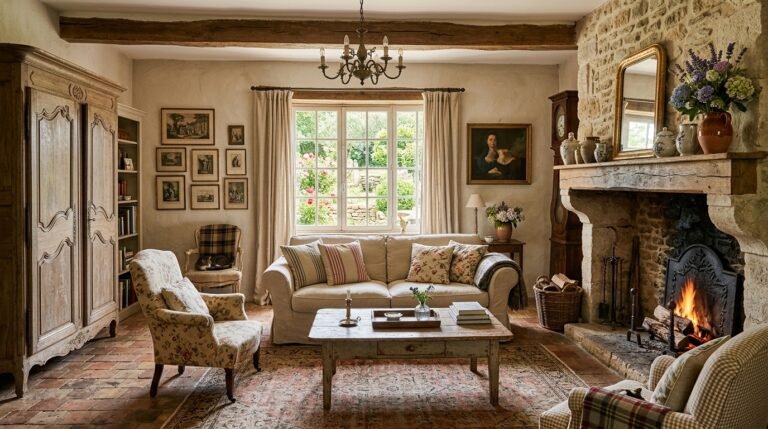
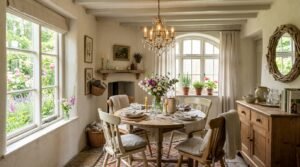
Think limestone walls in southern France. That chalky white that’s not pure white. It leans yellow in sunlight, then almost peach at sunset. Old farmhouses were often finished in lime plaster, which naturally dries to soft off white tones. You get this breathable surface that shifts in tone through the day. It feels alive, almost.
You might notice that many traditional French interiors layer three or four neutrals in one room. Cream walls. Beige linen. Taupe stone floors. A slightly darker oak beam overhead. Nothing matches perfectly. That mismatch is the charm.
Interior paint brands today often list shades like antique white, Swiss coffee, linen white among their best sellers. In North America alone, off white and beige tones consistently rank at the top of residential paint sales, especially in kitchen and living areas. You see that same preference echoed in rustic European homes, even if the marketing language is different.
And you probably think neutrals are boring. But in French country decorating, they are the calm field where the color flowers grow. Without them, the room tips into chaos real quick.
Sun Washed Blues and the Sky Over Provence
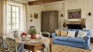
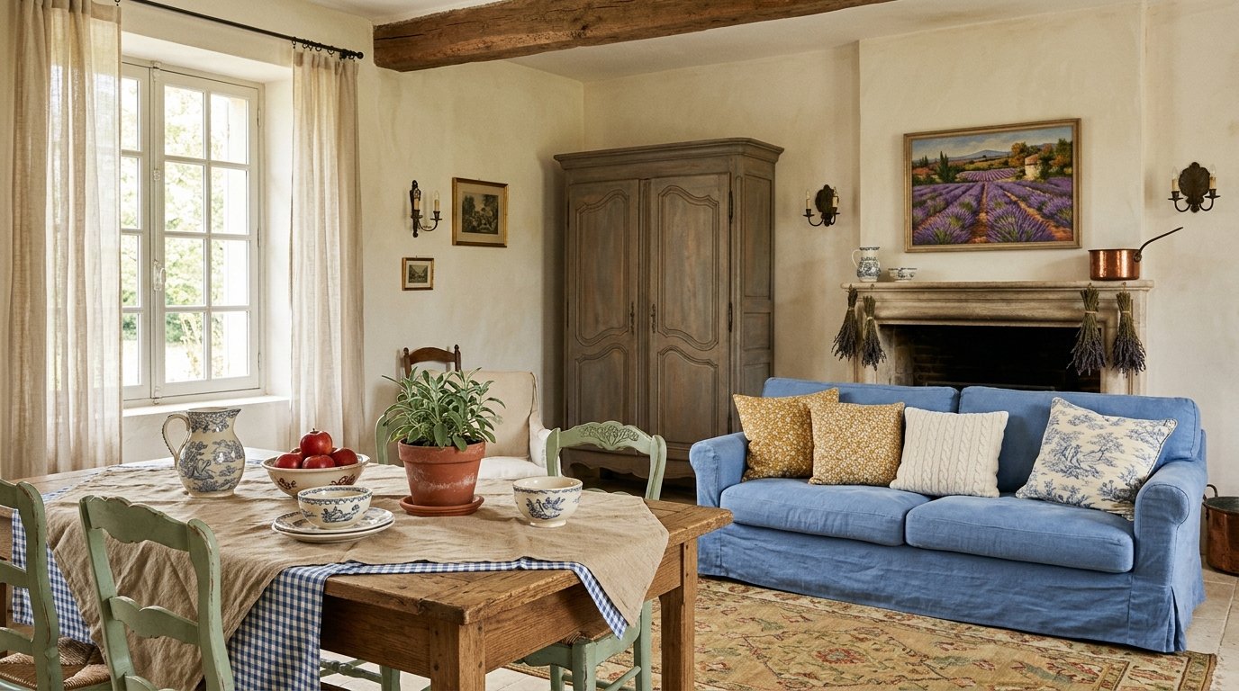
Now the blues. You can’t ignore them. French country blue is not navy. It is not electric. It is faded. Almost dusty. Like denim left in the sun too long.
In regions like Provence, shutters are often painted in muted blue tones. Historically, mineral pigments made from azurite and other natural sources created soft blue greens rather than sharp primary blues. That’s why you see shades that hover between blue and gray, sometimes almost green.
You walk into a kitchen painted in a soft cornflower or a smoky blue and it feels like air is moving, even when the windows are shut. That’s dramatic sounding, I know. But it’s true.
Lavender fields are a big part of southern France’s agricultural identity. France produces a significant portion of the world’s lavender essential oil, much of it grown in Provence. That soft purple blue influence sneaks into textiles, pottery, even cabinetry sometimes.
So you might pair a creamy wall with muted blue cabinets and aged brass hardware. Or blue toile fabric against a neutral backdrop. It never feels like a beach house. It feels older than that. Heavier. More grounded.
Lavender, Soft Purple, and That Almost Faded Floral Thing
Speaking of lavender, yes, purple exists in French country interior design, but not royal purple. Not velvet drama. It’s the kind of purple that looks like it’s been left outside for a season.
You’ll see it in floral patterns. Toile de Jouy often includes soft mauve or dusty lilac motifs against cream backgrounds. That pattern dates back to the 18th century in France, originally produced near Versailles. The colors were typically limited and muted due to dye technology of the time.
You don’t splash lavender everywhere. That would feel like a soap shop. Instead, maybe cushions. A throw. A ceramic bowl with a hint of violet glaze.
It’s like seasoning. Too much ruins it. A little makes you pause and smile.
Warm Yellows That Feel Like Butter and Sunlight
There’s something about French country yellow that feels edible. Not lemon candy yellow. More like butter left on a wooden table. Or wheat fields in late summer.
Rural homes often used yellow ochre pigments derived from natural clay. Ochre has been used in European architecture for centuries. It gives walls that golden, earthy warmth without going bright.
In kitchens especially, soft yellow walls feel natural. Paired with terracotta tiles or rustic oak cabinets, the color warms everything. You might even notice how yellow reflects candlelight in a way that white doesn’t. It glows softer.
There’s a reason warm tones consistently show up in traditional European interiors. Before electric lighting, warm pigments helped compensate for dim conditions. That’s practical, not just aesthetic.
So if you choose yellow, choose muted. Choose the kind that looks like it belongs next to bread and olive oil.
Earthy Greens Inspired by Olive Groves
Green in French country decor is often olive, sage, or moss. Not emerald. Not neon. Think of olive trees under Mediterranean sun. Their leaves aren’t bright green. They are grayish. Silvery almost.
France is one of Europe’s historic olive oil producers, particularly in the southern regions. Those landscapes influence interiors more than people realize. You see green in painted cabinets, in ceramic tiles, in distressed furniture.
Sage green has become extremely popular in modern design too, but in French country spaces it feels older. More weathered. Often paired with cream and wood tones.
A green hutch against a neutral stone wall. That image alone tells you what the palette is doing. It’s borrowing from the land. Always from the land.
Rustic Reds, Terracotta, and Clay
Red shows up, but carefully. Think terracotta pots. Think brick. Think wine. France is one of the largest wine producers globally, and deep red tones associated with vineyards and rustic cellars quietly influence decor.
You won’t paint a whole room bright red in a traditional French country home. But you might see deep muted red in textiles, patterned rugs, or ceramic dishes.
Terracotta flooring is common in southern France. Those clay tiles bring warmth underfoot. They lean orange red but softened by dust and age. That aged look is important. Nothing looks factory fresh.
Sometimes you’ll see deep burgundy woven into a toile pattern. Or a faded red stripe in linen curtains. Subtle, but it anchors the lighter tones.
The Role of Natural Materials in Shaping Color
Color in French country interiors isn’t separate from material. Stone walls are beige or gray. Exposed oak beams add honey brown. Linen is creamy and slightly wrinkled. Always slightly wrinkled.
Limestone, oak, terracotta, wrought iron. These materials dictate the palette more than trend forecasts ever could. You don’t choose a bright color when your house is built from stone quarried nearby. You respond to what’s already there.
There’s something honest about that. A bit stubborn maybe.
Even today, surveys in home design industries show continued preference for natural finishes and earthy color schemes in kitchens and living rooms. That preference echoes what rural French homes have done for centuries without calling it a trend.
Mixing Colors Without Making a Mess
Here’s where it gets tricky. You can’t just grab blue, yellow, green, red and toss them together like confetti. The reason French country decor colors work is restraint.
One dominant neutral. One secondary earthy tone. One or two accents at most.
And patterns matter. Toile, small florals, subtle stripes. They distribute color gently across space. You don’t see huge blocks of bold pigment. You see layers.
Sometimes you’ll walk into a room and not even register the color immediately. You just feel warmth. Comfort. Like you could sit there for hours and forget your phone exists.
That’s the goal. Not perfection. Not drama. Comfort that feels inherited rather than purchased yesterday.
Why These Colors Still Matter
It’s funny how these colors, rooted in centuries old rural life, keep resurfacing in modern design cycles. Trends shift toward minimalism, then swing back to warmth. Toward gray, then back to cream. Toward stark white, then back to earthy tones.
Maybe people are tired of sharp edges and synthetic brightness. Maybe you are too. There’s something reassuring about colors that look like they’ve been there a long time.
French country decor isn’t about copying a farmhouse in Provence brick by brick. It’s about borrowing the palette that came from land, climate, agriculture, and time. Cream like stone. Blue like worn shutters. Yellow like late afternoon sun. Green like olive leaves. Red like clay and wine.
You don’t need all of them. You probably shouldn’t use all of them at once anyway. But when you get it right, even a small apartment can feel like it’s been standing quietly for a hundred years.
And that, honestly, feels kind of nice.